




- Fishbone Diagram: Group brainstorming activity that helps to clearly define the problems
NAWCTSD is having in their current collaboration methods
- Define Phase Poster: Presentational piece to showcase established problem statement,
sponsor/stakeholder, planned approach, preliminary findings, and illustrations
- Define Phase Website: An electronic tool to summarize an overview of the project including a
timeline of submitted and future deliverables
- Define Phase Report: An extensive report on the objectives worked on and met in the current
phase centered around the defined data compiled in the List of Figures &
Tables
House of Quality Matrix
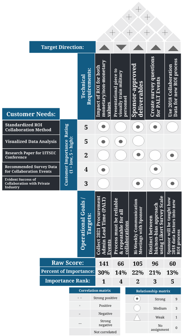
The House of Quality Matrix
indicates several
notable attributes that the senior design
team will consider throughout the completion of this project. After
establishing the customer needs and technical requirements from the meeting
conducted with sponsor Cassie Muffley, the matrix was labeled as such to
correlate how each of these objectives would be met.
From this, the team
assigned a correlation matrix as the roof of the house to visualize which
technical requirements are in alignment. With the given “Correlation matrix
key”, one can see that a positive “+” in each box of the roof distinguishes
almost each technical requirement to build off one another. The arrow above
each requirement illustrates
the target direction and how it affects the direction of the assigned project
deliverable.
The “Relationship matrix key” gives
insight into how the “Raw Score”, “Percent of Importance”, and “Importance
Rank” are calculated. Each circle with a dot inside of it is assigned as a
numerical “9” for the strongest relationship, a circle with no dot a “3” for
medium, a triangle a “1” for weak, and a blank space for no relationship
assignment. These visual symbols are then multiplied by the assigned customer
importance rating (1 = low, 5 = high) set by what the senior design team feels
the sponsor should prioritize in their needs. The sum of the products of each
horizontal technical requirement is then placed in the “Raw Score” section.
Once you have calculated all requirement raw scores then the sum of all these
scores is used to divide over and find a percentage for "Percent of
Importance” and “Importance Rank”. Take for example our most important value,
the basis of the project, to “Establish impact of ROI monetary &
non-monetary values”. This technical requirement has two (9 x 5)’s, one (3 x
2), one (9 x 4), and one (3 x 3). These sums all add up to 141, our “Raw
Score”. After finding the rest, the sum of all raw scores (468) can be used in
the denominator under the raw score numerator for each percent of importance.
Hence, 141/486 = .3012 = 30% is the highest importance rank.
Work Breakdown Structure
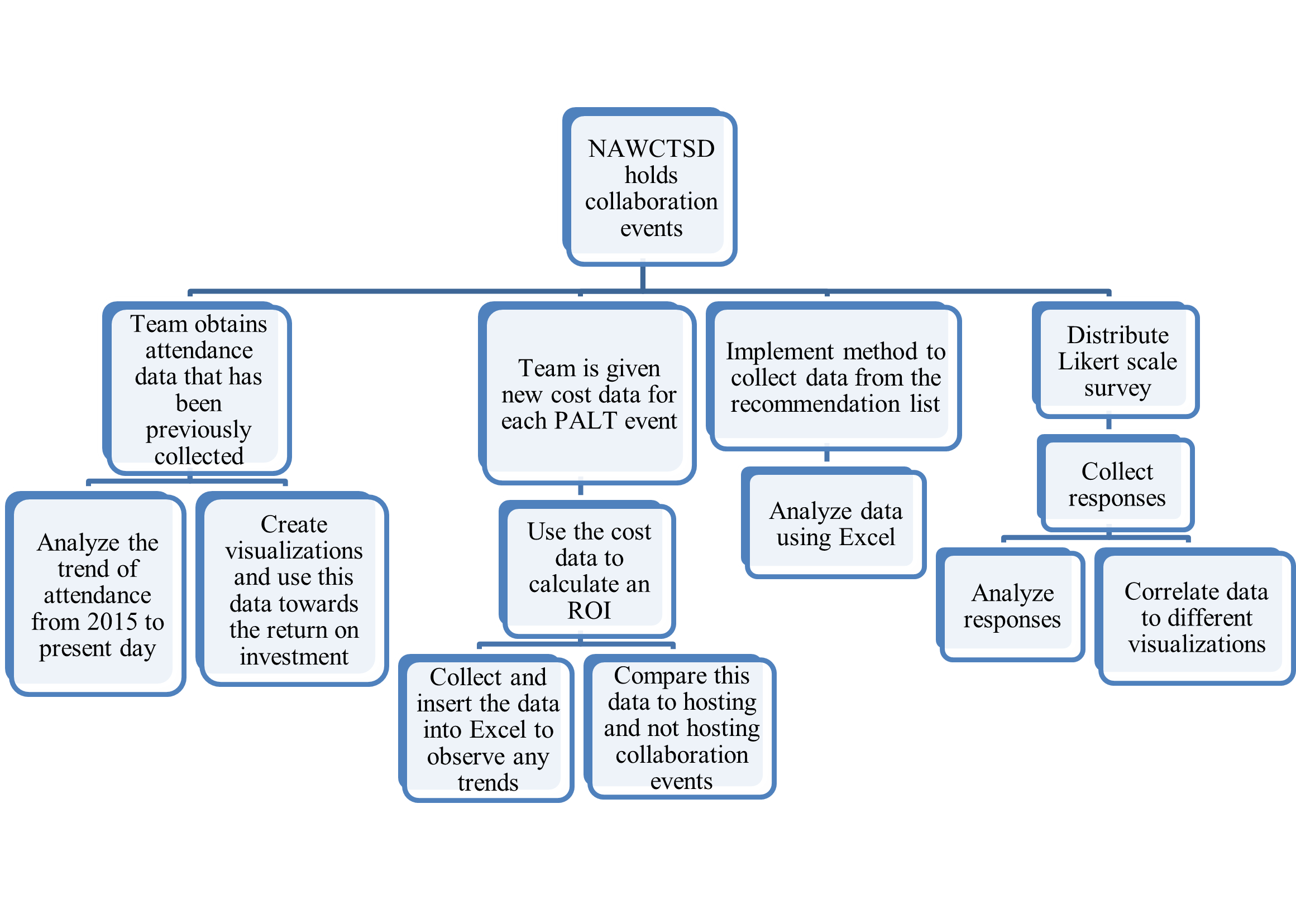
The work breakdown structure above shows the best way to make use of given and new data that will help determine the return on investment for this project. The work that must be done on the attendance data that has already been collected includes analyzing it and determining what the trends in attendance represent when compared to collaboration. For example, if over the past seven years attendance for the PALT event has steadily increased, the team will determine why this trend has occurred and what relationship it has to collaboration. The team has requested data from NAWCTSD such as how many contracts have been awarded and this information can be useful when compared to the attendance data. The right side of the work breakdown structure reviews the work that the team must conduct for the new process to collect survey data. This process will include using the relevant cost data for each PALT event to calculate an ROI. The work breakdown structure helps organize the team’s main objectives to complete the project.
Network Table & Diagram
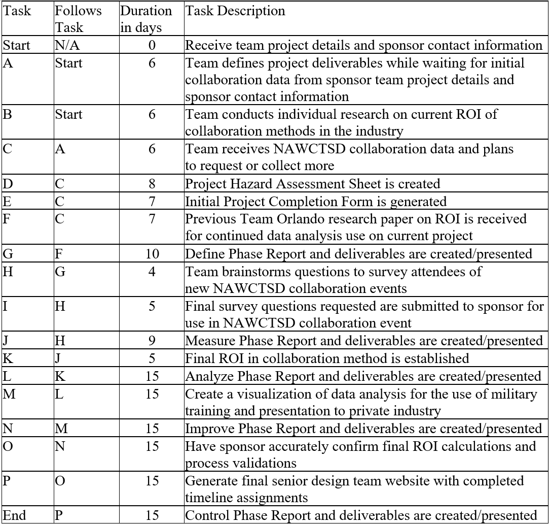
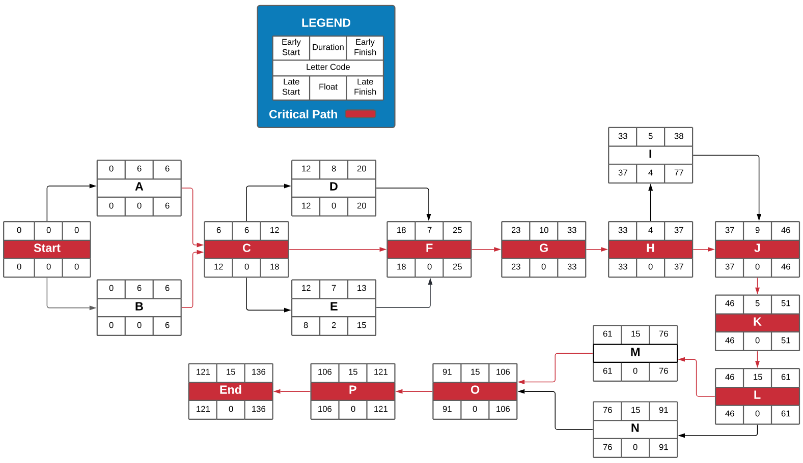
A network diagram was created to illustrate how the senior design team would schedule the completion of each milestone in the Define, Measure, and Analyze Phase, along with the prospective deliverables required in future phases. The above Network Diagram was created with all project objectives along with a timeline to follow. The Network Diagram Table provided is used as a legend for the Network Diagram to detail the letter code milestone in each phase of the project and how it sums to the overall progress of completion. The numbers in the network diagram are all represented in days, and the float value given shows the slack flexibility of each task. Using a prospective duration of completion time for each letter code, a total early start, late start, early finish, and late finish time was calculated for the senior design to monitor when deciding what tasks to prioritize. The critical path of the diagram starts out with letter code C, as even with doing the utmost amount of research and defining of the project, the senior design team could not start their analyzation of the return-on-investment method without the appropriate collaboration data. The critical path moves forward in red taking into consideration what task items must be on time to prevent project delay. This complete approximation throughout the end of the Spring 2022 semester was calculated to describe the critical time in 121 days that it would take to endure the entirety of the project length.